Section 01
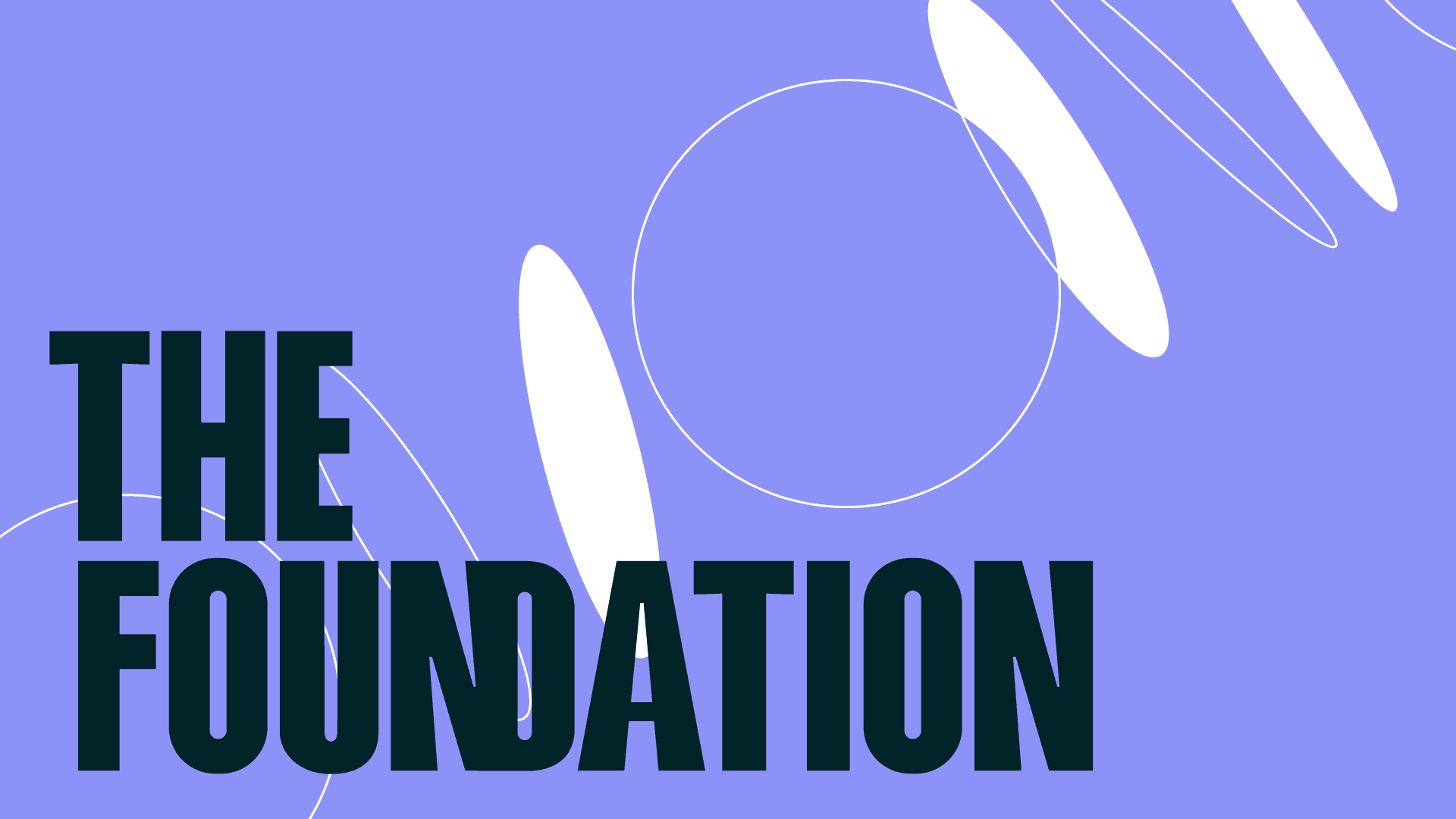
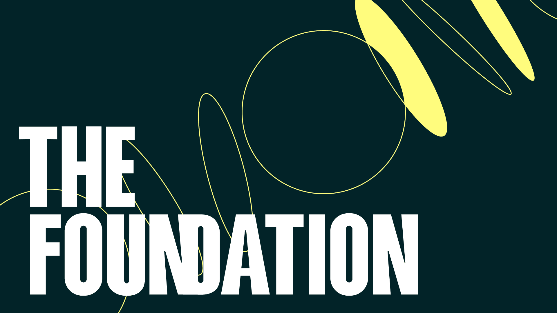
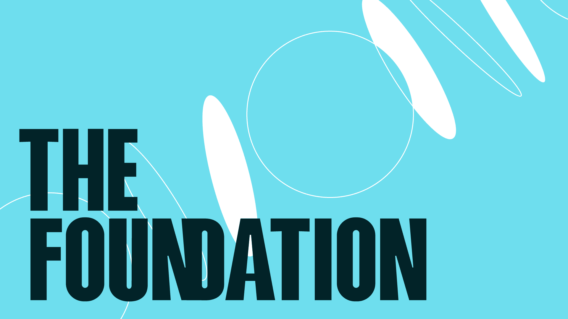
Our brand
Why we exist
TheFoundation helps people move forward with confidence. We keep experiences simple, clear, and human, focusing on trust and momentum in every interaction.
How we sound
Our voice is direct and approachable. We avoid unnecessary jargon and communicate with optimism, clarity, and practical guidance.
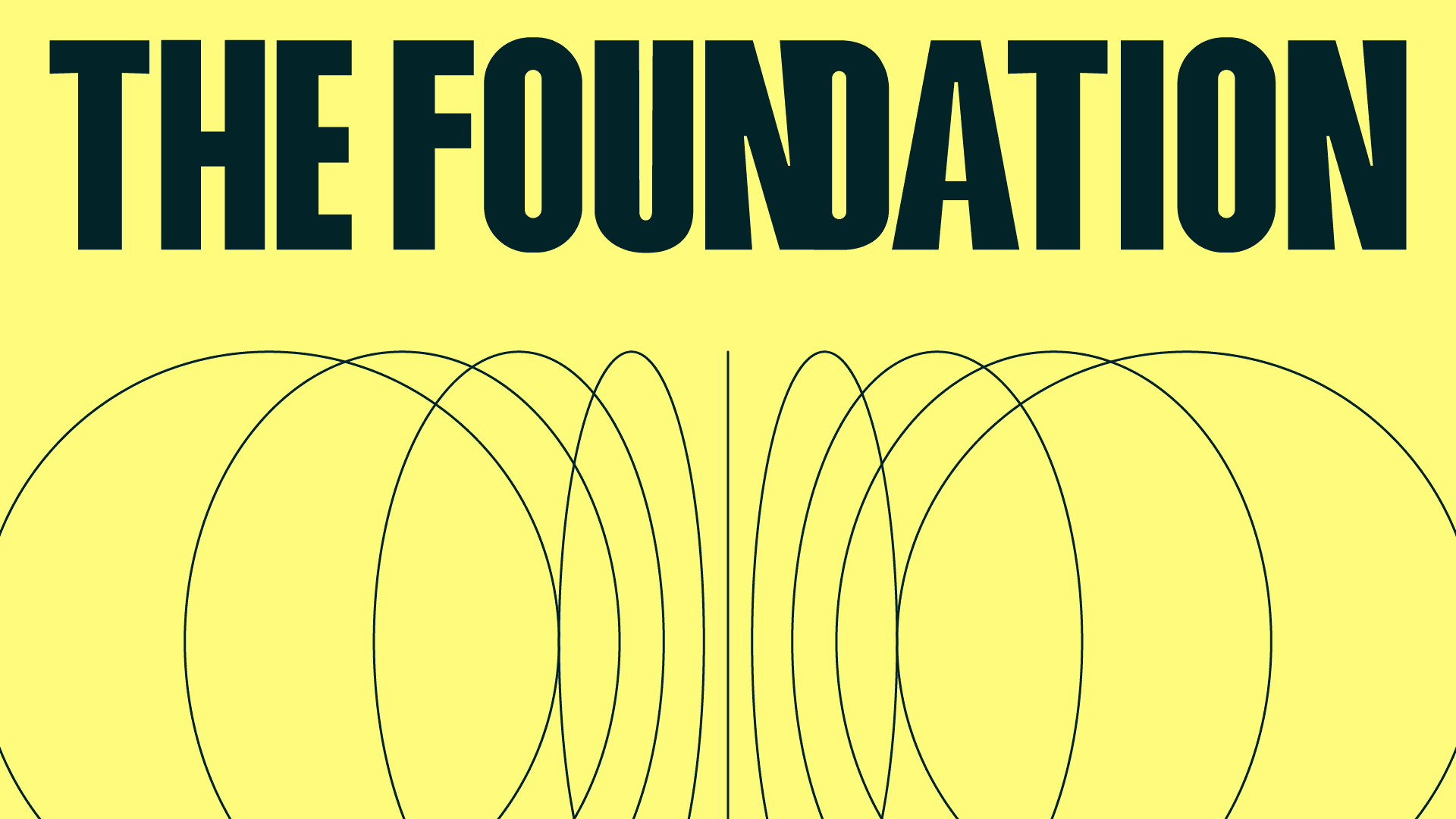
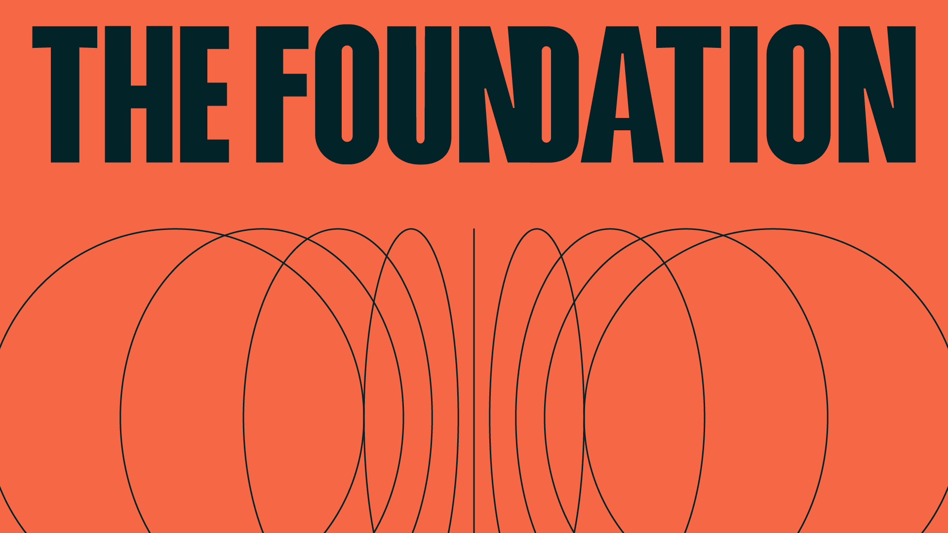
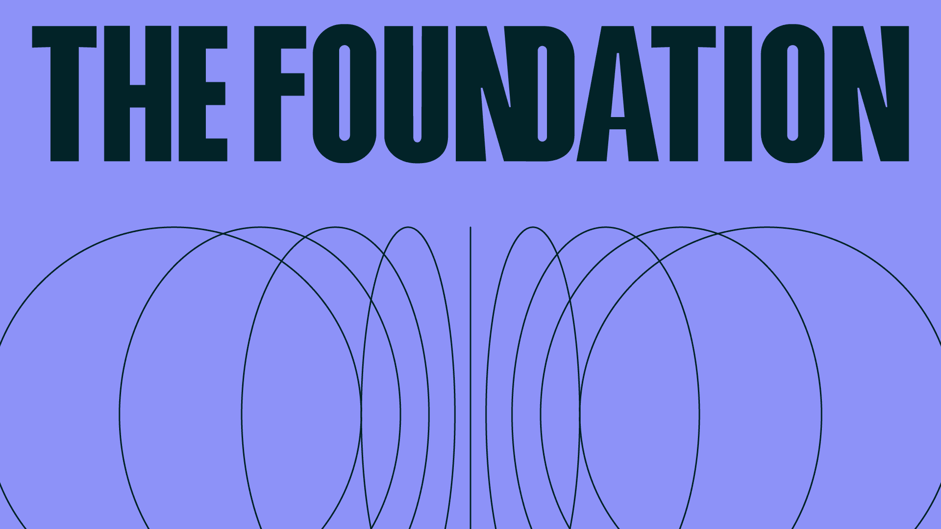
Proof in practice
From campaign touchpoints to service experiences, our identity system scales consistently across digital, print, and in-person environments.
Section 02
Toolkit
Everything needed to build on-brand work: logo usage, color system, and typography foundations.
Toolkit / Logo
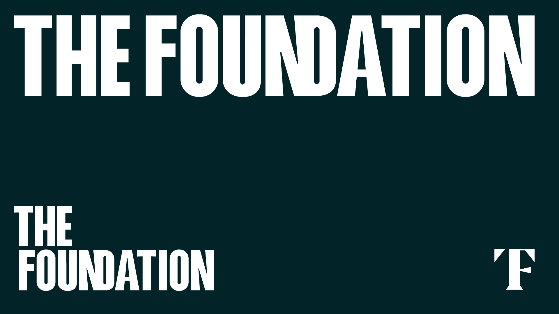
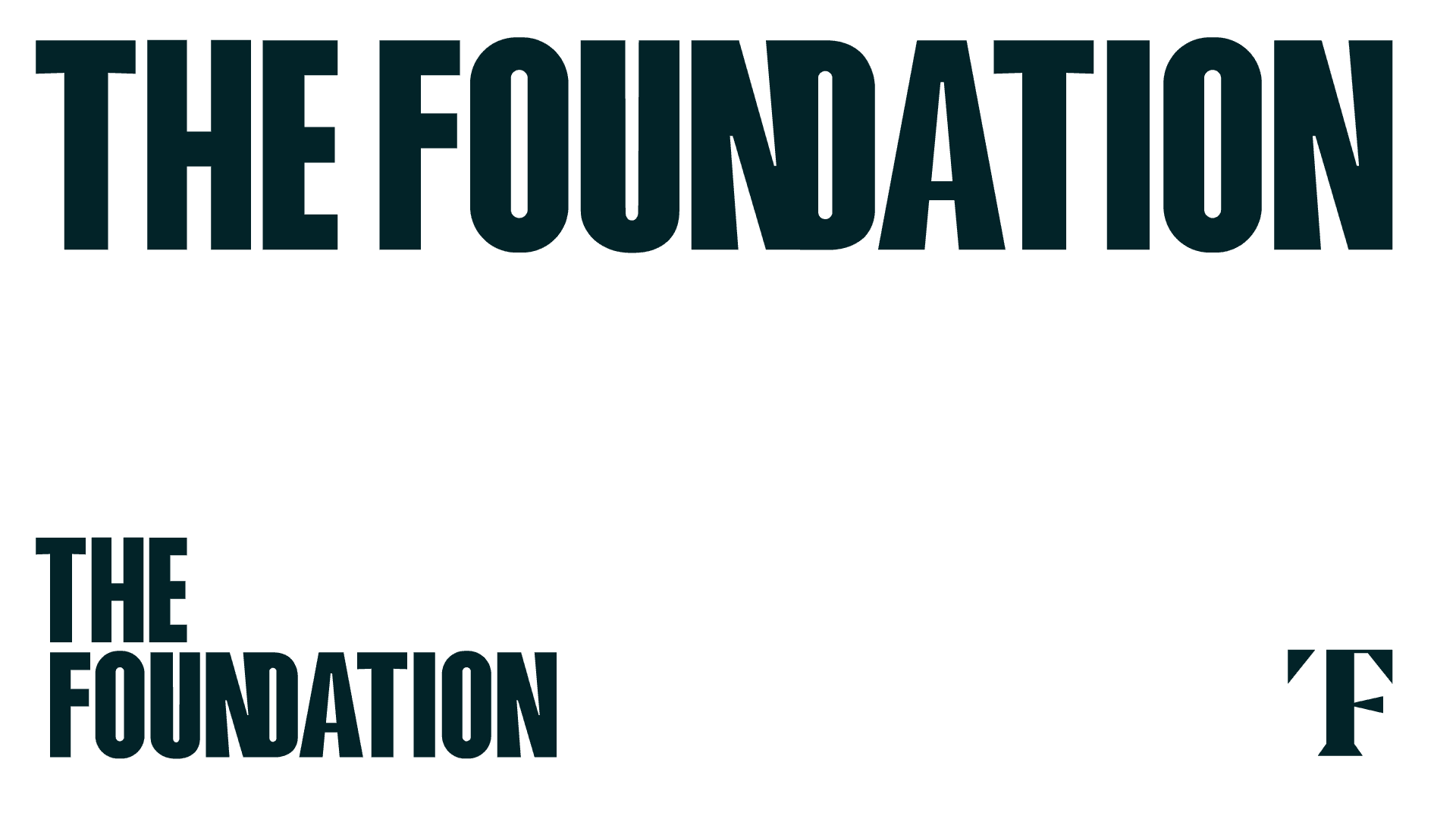
Logo
The logo combines a distinctive symbol with clear typography to create a recognizable and scalable identity.
Clear Space
 XXXX
XXXXMaintain a minimum clear space equal to the height of the core symbol on all sides to preserve legibility and impact.
Logo Do's and Don'ts
- Use the logo on solid backgrounds
- Maintain clear space around the logo
- Use approved color variations
- Scale proportionally
- Do not distort or stretch the logo
- Do not use unapproved colors
- Do not add effects or shadows
- Do not place on busy backgrounds
Toolkit / Wordmark
Wordmark
The wordmark is the brand name in the logo.

Clear Space
 XXXX
XXXXMaintain a minimum clear space equal to the height of the core symbol on all sides to preserve legibility and impact.
Logo Do's and Don'ts
- Use the logo on solid backgrounds
- Maintain clear space around the logo
- Use approved color variations
- Scale proportionally
- Do not distort or stretch the logo
- Do not use unapproved colors
- Do not add effects or shadows
- Do not place on busy backgrounds
Toolkit / Color
Color Palette
The core color system balances trust, energy, and clarity for flexible use across communications.
Primary Palette
Navy
Primary brand color for key actions, links, and highlights
50
#AFF0FE
RGB 175, 240, 254
100
#2DDFF8
RGB 45, 223, 248
200
#21ADC0
RGB 33, 173, 192
300
#147B89
RGB 20, 123, 137
400
#094C55
RGB 9, 76, 85
500
#022328
RGB 2, 35, 40
600
#011D21
RGB 1, 29, 33
700
#01191D
RGB 1, 25, 29
800
#011417
RGB 1, 20, 23
900
#00090B
RGB 0, 9, 11
Yellow
Primary brand color for key actions, links, and highlights
50
#FFFFEA
RGB 255, 255, 234
100
#FFFEDE
RGB 255, 254, 222
200
#FFFECB
RGB 255, 254, 203
300
#FFFDB3
RGB 255, 253, 179
400
#FFFD99
RGB 255, 253, 153
500
#FFFC7D
RGB 255, 252, 125
600
#DDDA6C
RGB 221, 218, 108
700
#BEBC5D
RGB 190, 188, 93
800
#A4A251
RGB 164, 162, 81
900
#949249
RGB 148, 146, 73
Secondary Palette
Green
Secondary accent color
50
#DCFBF0
RGB 220, 251, 240
100
#C8F9E8
RGB 200, 249, 232
200
#A8F6DA
RGB 168, 246, 218
300
#81F2CA
RGB 129, 242, 202
400
#56EDB8
RGB 86, 237, 184
500
#27E8A4
RGB 39, 232, 164
600
#22C98E
RGB 34, 201, 142
700
#1DAD7A
RGB 29, 173, 122
800
#19966A
RGB 25, 150, 106
900
#17875F
RGB 23, 135, 95
Red
Secondary accent color
50
#FEE7E1
RGB 254, 231, 225
100
#FDD8D0
RGB 253, 216, 208
200
#FBC2B4
RGB 251, 194, 180
300
#FAA793
RGB 250, 167, 147
400
#F8886E
RGB 248, 136, 110
500
#F66746
RGB 246, 103, 70
600
#D5593D
RGB 213, 89, 61
700
#B74D34
RGB 183, 77, 52
800
#9F422D
RGB 159, 66, 45
900
#8F3C29
RGB 143, 60, 41
Grey
Secondary accent color
50
#EDEDED
RGB 237, 237, 237
100
#E3E3E3
RGB 227, 227, 227
200
#D3D3D3
RGB 211, 211, 211
300
#BFBFBF
RGB 191, 191, 191
400
#A9A9A9
RGB 169, 169, 169
500
#919191
RGB 145, 145, 145
600
#7D7D7D
RGB 125, 125, 125
700
#6C6C6C
RGB 108, 108, 108
800
#5D5D5D
RGB 93, 93, 93
900
#545454
RGB 84, 84, 84
Cyan
Secondary accent color
50
#DFFAFF
RGB 223, 250, 255
100
#CCF8FF
RGB 204, 248, 255
200
#AEF3FF
RGB 174, 243, 255
300
#8AEEFF
RGB 138, 238, 255
400
#62E8FF
RGB 98, 232, 255
500
#36E2FF
RGB 54, 226, 255
600
#2FC3DD
RGB 47, 195, 221
700
#28A8BE
RGB 40, 168, 190
800
#2392A4
RGB 35, 146, 164
900
#1F8394
RGB 31, 131, 148
Purple
Secondary accent color
50
#EDEEFE
RGB 237, 238, 254
100
#E2E3FD
RGB 226, 227, 253
200
#D1D3FC
RGB 209, 211, 252
300
#BDC0FB
RGB 189, 192, 251
400
#A6AAFA
RGB 166, 170, 250
500
#8D92F8
RGB 141, 146, 248
600
#7A7ED6
RGB 122, 126, 214
700
#696DB9
RGB 105, 109, 185
800
#5B5EA0
RGB 91, 94, 160
900
#525590
RGB 82, 85, 144
Color Usage
Navy
Primary brand color for key actions, links, and highlights
50
100
200
300
400
500
600
700
800
900
Yellow
Primary brand color for key actions, links, and highlights
50
100
200
300
400
500
600
700
800
900
Green
Secondary accent color
50
100
200
300
400
500
600
700
800
900
Red
Secondary accent color
50
100
200
300
400
500
600
700
800
900
Grey
Secondary accent color
50
100
200
300
400
500
600
700
800
900
Cyan
Secondary accent color
50
100
200
300
400
500
600
700
800
900
Purple
Secondary accent color
50
100
200
300
400
500
600
700
800
900
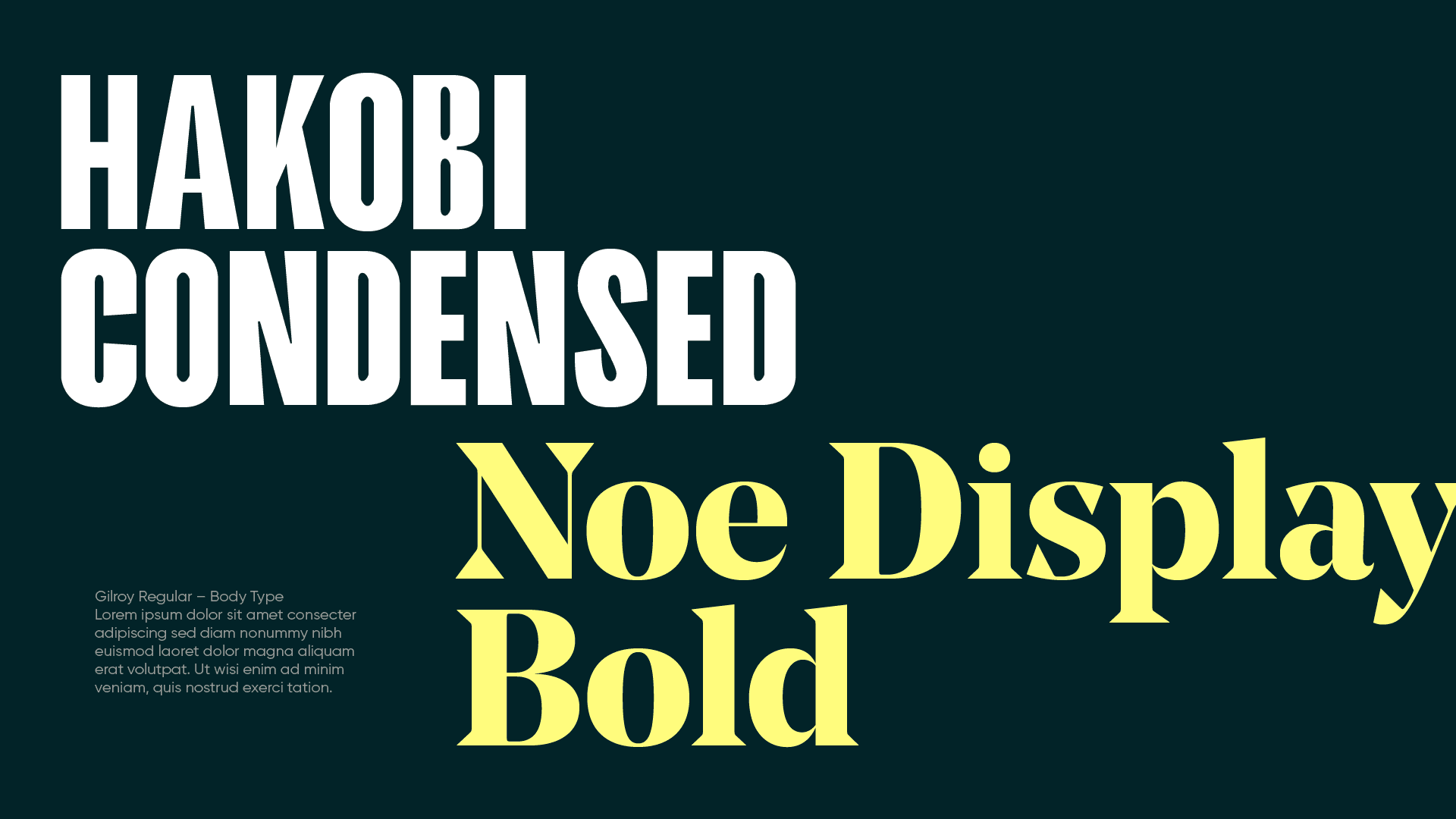
Toolkit / Typography
Typography
Sofia is the selected brand typeface, used for clear hierarchy, modern tone, and strong readability.
Sofia
Light 300
Sofia
Regular 400
Sofia
Medium 500
Sofia
SemiBold 600
Sofia
Bold 700
Sofia
ExtraBold 800
Sofia
Type Scale
Heading 1
Bold 60px / Line height 1.2
Heading 2
Bold 48px / Line height 1.2
Heading 3
Bold 36px / Line height 1.3
Heading 4
SemiBold 24px / Line height 1.4
Body Large
Medium 20px / Line height 1.6
Body Regular
Regular 16px / Line height 1.6
Body Small
Regular 14px / Line height 1.6
Hakobi is the selected brand typeface, used for clear hierarchy, modern tone, and strong readability.
Hakobi
Light 300
Hakobi
Regular 400
Hakobi
Medium 500
Hakobi
SemiBold 600
Hakobi
Bold 700
Hakobi
ExtraBold 800
Hakobi
Type Scale
Heading 1
Bold 60px / Line height 1.2
Heading 2
Bold 48px / Line height 1.2
Heading 3
Bold 36px / Line height 1.3
Heading 4
SemiBold 24px / Line height 1.4
Body Large
Medium 20px / Line height 1.6
Body Regular
Regular 16px / Line height 1.6
Body Small
Regular 14px / Line height 1.6
Noe is the selected brand typeface, used for clear hierarchy, modern tone, and strong readability.
Noe
Light 300
Noe
Regular 400
Noe
Medium 500
Noe
SemiBold 600
Noe
Bold 700
Noe
ExtraBold 800
Noe
Type Scale
Heading 1
Bold 60px / Line height 1.2
Heading 2
Bold 48px / Line height 1.2
Heading 3
Bold 36px / Line height 1.3
Heading 4
SemiBold 24px / Line height 1.4
Body Large
Medium 20px / Line height 1.6
Body Regular
Regular 16px / Line height 1.6
Body Small
Regular 14px / Line height 1.6
Section 03
Brand in action
Examples of the brand system in use across campaigns and service touchpoints.